Design system
At vcita, we prioritize creating a consistent user experience across our product suite. I led the effort to develop a unified design system for all our platforms.
Tools
Figma, Storybook, Zerohight
Role
UX/UI Design

Problem
The primary issue was the absence of a standardized design system across vcita’s platform, leading to inconsistent user experiences and inefficiencies in development due to varying interpretations of design files by different teams.
Research and Discovery
To address these issues, I embarked on a thorough analysis of existing brand guidelines and design files. This phase helped in identifying the core problems and laid the groundwork for the design system’s development.
Analyzing platform
Reviewing the existing implementations across platforms to identify common elements and discrepancies.
Interviewing stakeholders
Gathering insights from designers, developers, and product managers to understand their pain points and expectations.
Some Challenges
The integration of a new design system across multiple frameworks presented unique challenges:
Limited engineering resources
With finite developer availability, prioritizing tasks and managing workload was critical.
New brand position
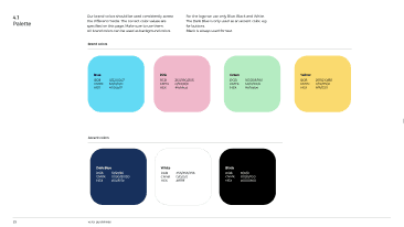
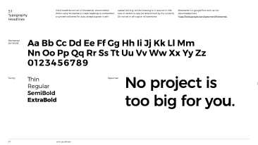
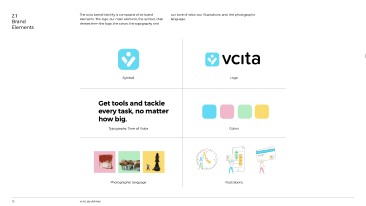
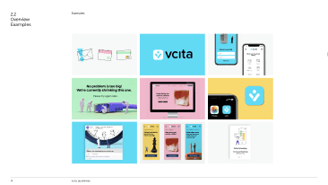
Aligning new brand guidelines with existing platforms without disrupting ongoing operations.
Framework compatibility
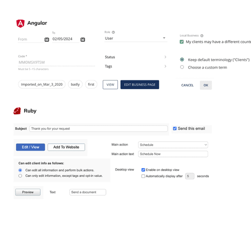
Ensuring that the design system was adaptable and functional across Angular, Vue, and Ruby without favoring one over the other.
Problems to solve
Based on the initial research and identified challenges, several key problems needed resolution:
How might we...
structure and organize the design system so that users can easily find the correct components to use?
apply interaction in the design system to help better visualize the real product in prototype and user testing?
deliver a clear guideline to developers to avoid misalignment between design and development phases?
create a design system that is scalable across all viewports?
Establishing core guidelines for design system
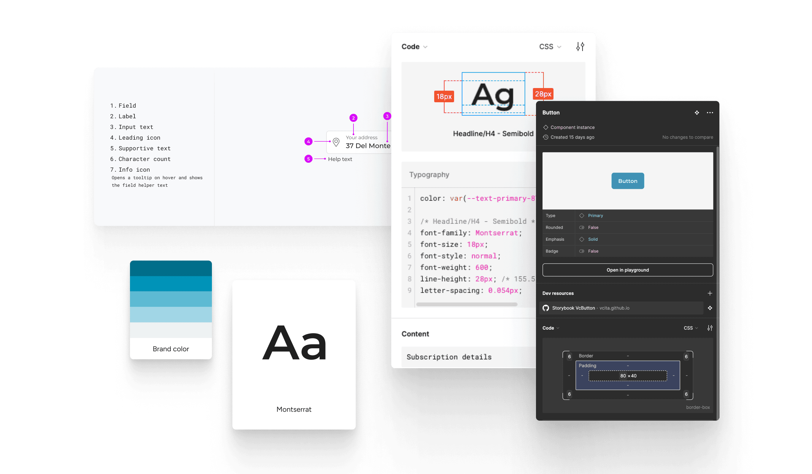
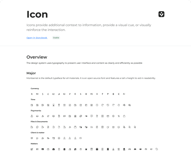
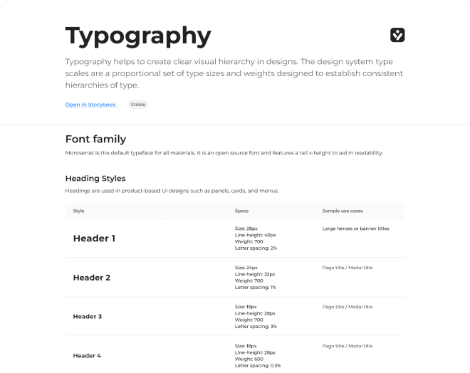
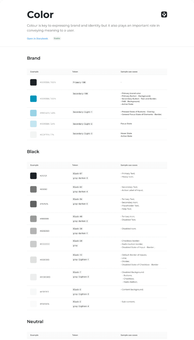
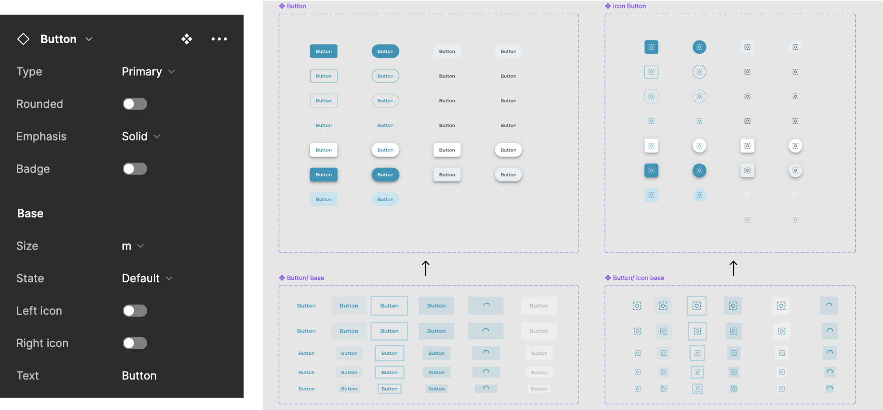
The validated components were compiled into a comprehensive component library in Figma, becoming the single source of truth for designers and developers. The library supports ease of use and comprehensive access to design assets. Creating reusable components can save time and effort in the long run, fostering a more efficient workflow and maintaining a uniform design language across all products and pages
Create reusable components
The validated components were compiled into a comprehensive component library in Figma, becoming the single source of truth for designers and developers. The library supports ease of use and comprehensive access to design assets. Creating reusable components can save time and effort in the long run, fostering a more efficient workflow and maintaining a uniform design language across all products and pages
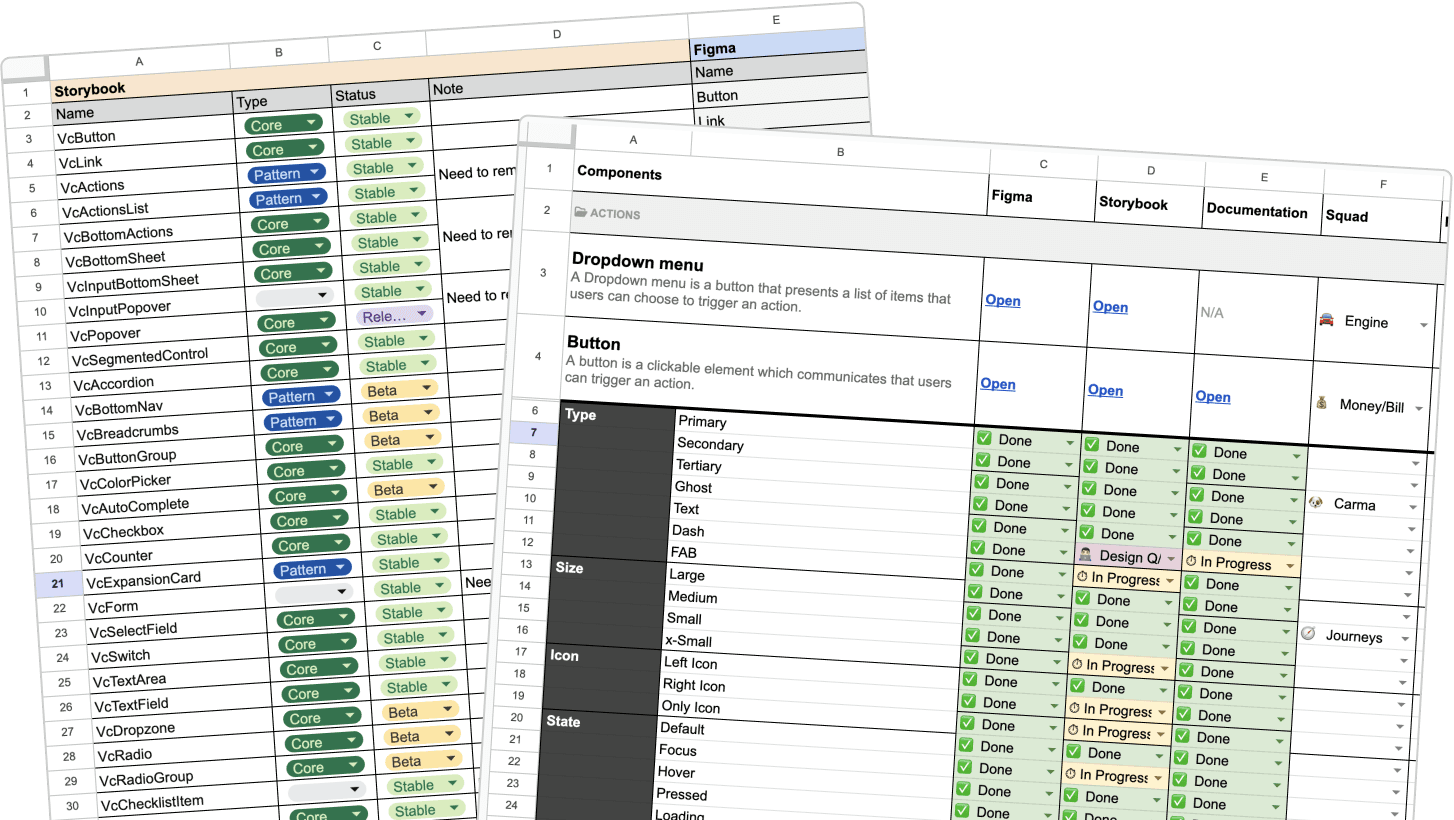
Coordinated planning for design system enhancements
We focused on planning the creation and integration of design components aligned with our product roadmap. The process involved reviewing upcoming features or projects with the design team to determine necessary additions to the design system. Based on this, we developed a plan with an estimated timeline, which aided product management in resource allocation and in setting clear expectations for the forthcoming phases and the projected results within the designated timeframe.
Crafting scalable components for multi-screen
A key feature of the design system was its scalability. The system was meticulously engineered to ensure that components could adjust seamlessly across different screen sizes—from mobile devices to ultra-wide monitors. This scalability was achieved through the use of responsive design principles and an auto-layout feature in Figma, which allowed components to adapt dynamically to various viewports without manual adjustment.
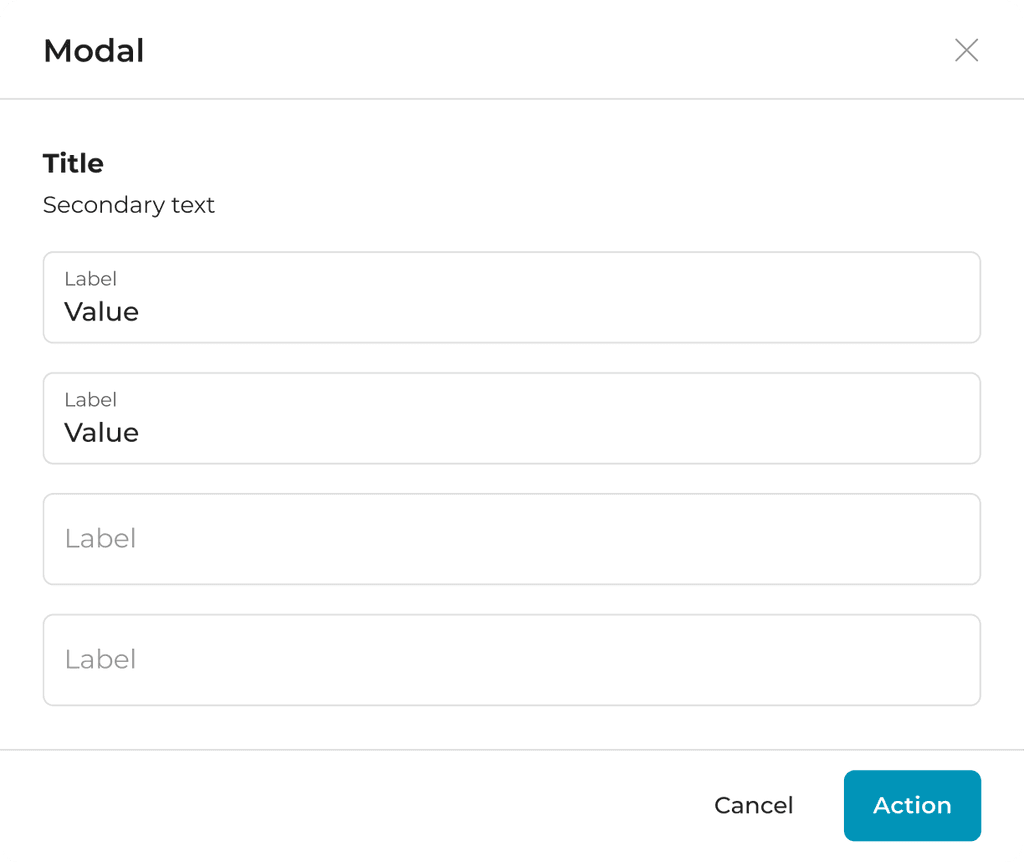
Viewports - 768px (Desktop)
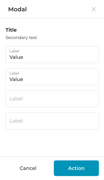
Viewports - 320px (Mobile)
Design system structure
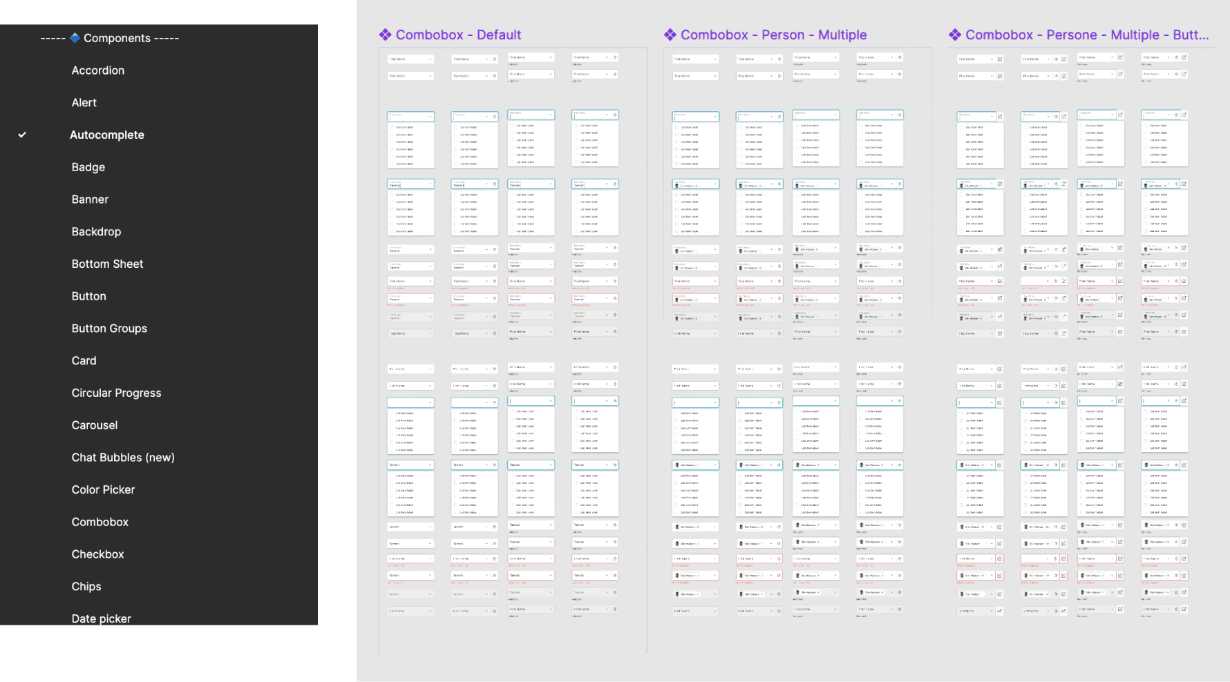
The structure of the design system followed the principles of atomic design. We organized the Figma master library to start with the most basic elements (atoms), building up to more complex components (molecules and organisms), and finally comprehensive templates and page designs. This hierarchical structure facilitated easy navigation and understanding of the design system.
Accessible
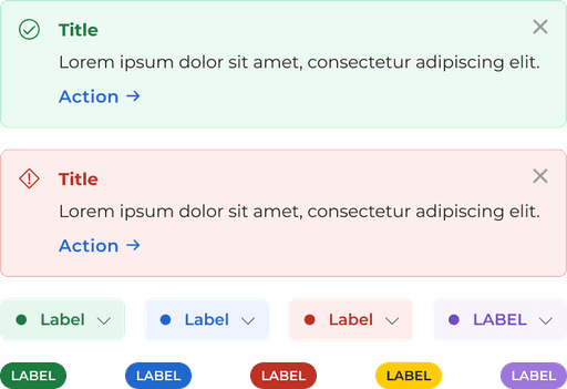
Ensuring accessibility was a paramount concern throughout the development of the design system. We adhered to WCAG guidelines to make sure that our components were accessible to all users, including those with disabilities.
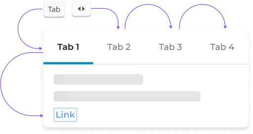
Keyboard accessibility
Allowing navigation through all interactive elements using a keyboard alone.
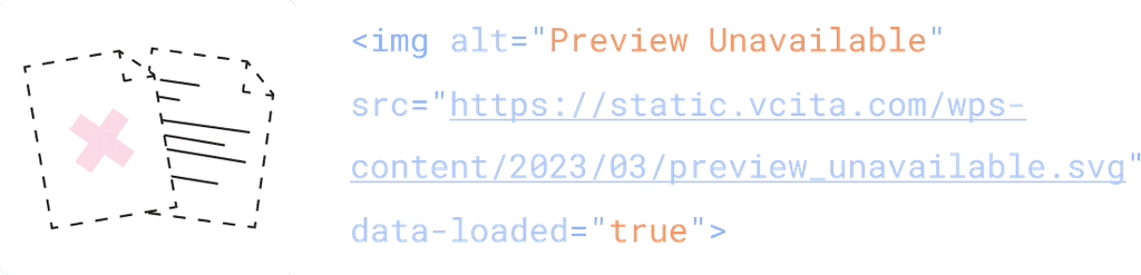
Alt text
Allowing description of an image that can be read by assistive technologies
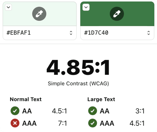
Color contrast checks
Ensuring that all text and interactive elements had sufficient contrast.
Development process
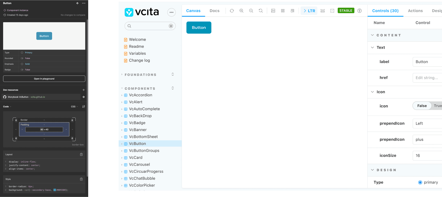
The development of the design system was highly iterative, involving continuous collaboration between designers and developers. We started by building a robust foundation with core components, then gradually expanded to include more complex and specific elements. Regular review sessions and agile methodology ensured that the system evolved in alignment with user needs and business goals.
Guides for every design component
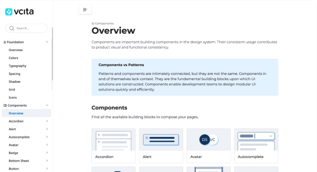
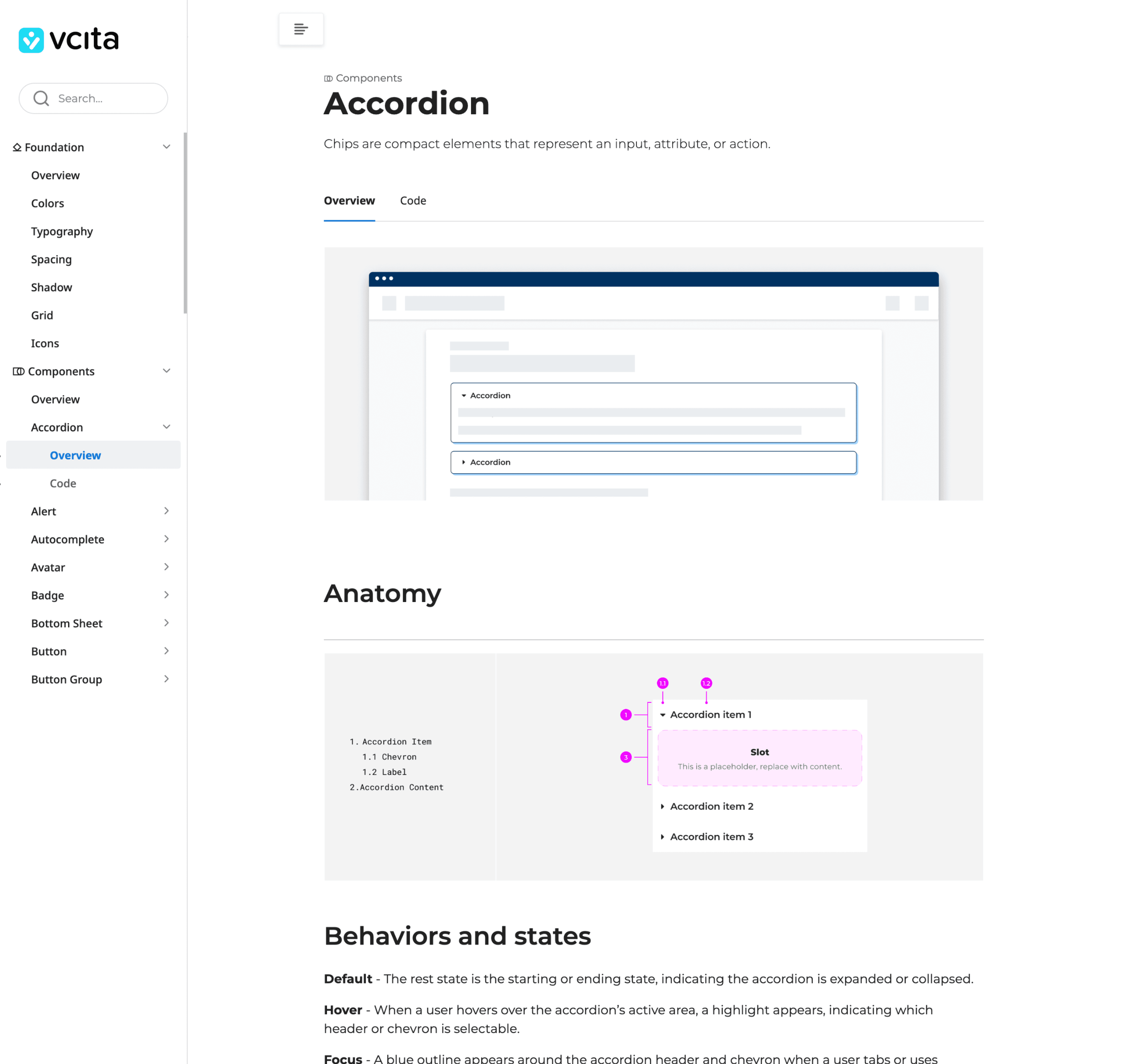
Comprehensive documentation accompanied every component and design pattern in the system. This documentation included detailed usage guidelines, code snippets for developers, and best practices. By providing clear and detailed instructions, we ensured that the design system could be easily adopted and correctly implemented by teams across the company.

Results
This project underscored the importance of a unified design system in a multi-framework environment. It highlighted the need for meticulous planning and comprehensive guidelines aligning with the company’s vision and user expectations. Integrating the system across platforms provided insights into the adaptability required for organizational and technological challenges.

Learned
Effective communication between designers and developers is crucial for resolving issues and ensuring a shared understanding of project goals. Robust documentation supports the use of the design system, while integrating accessibility from the start enhances user experience. Scalability planning ensures the design system remains relevant, and an iterative approach allows for ongoing improvements based on user feedback and changing business needs.